SHOP OUR HOME
I was talking with my mom and she described our home as elegantly casual which I think was the perfect way to describe my taste. I love beautiful things but I like to be comfortable too. I like people to come into my home and feel like they can settle in and relax. I love modern details when it comes to art and black and white elements, but I also love rustic pieces like distressed wood and traditional elements that make a home feel cozy and welcoming.
When selecting pieces for our home I make sure that each piece that comes through our doors is beautiful, comfortable, useful, timeless, neutral, elegant, good quality and something that I see us having for the remainder of our lives. Obviously not everything will last, but I would like to think that we are investing in our future and not shopping a trend.
THE KITCHEN
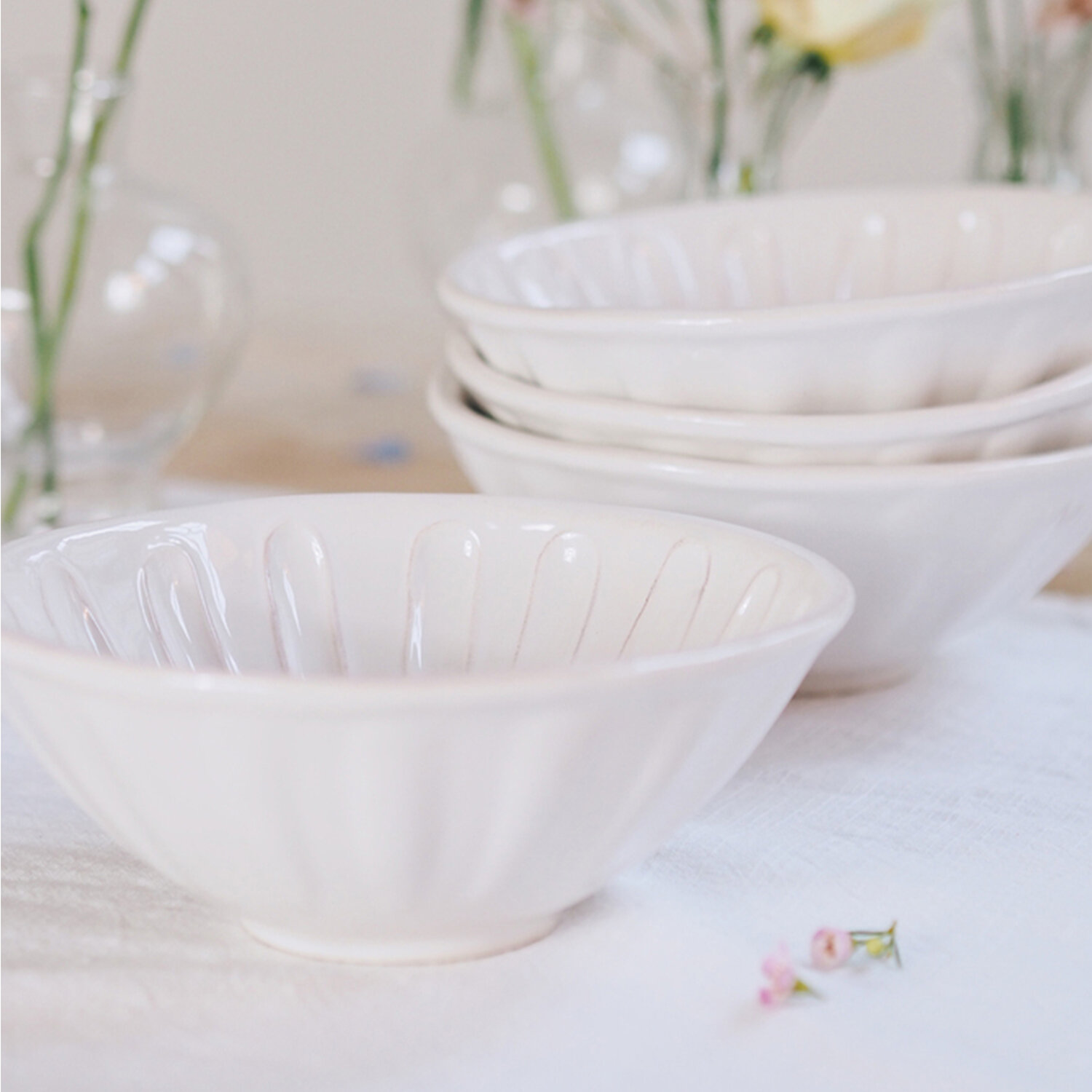
I love keeping our kitchen light and airy by sticking to cream coloured pieces like dishes and utensil holders. I also am loving mixing metals in our kitchen with gold, copper and polished nickel. I love pieces in my kitchen to serve a function but also want them to be beautiful. That’s why I splurge on pieces like a pepper grinder that I can leave out on the counter for easy access and that actually adds to the design of the space. Organizing your drawers and cabinets is key, It’s those little finishing touches that make using your kitchen something you look forward to.
anthropologie — rose gold mortar and pestle
Ours is no longer available but this one is really similar.
THE LIVING ROOM
Lets get real, I have long been inspired by Nancy Meyers movie homes. I have watched them on repeat just so that I feel like I am living in them. So when it came to furnishing our living room I took major inspiration from her. What I love about her living rooms is that they are always stylish but they also look so comfortable and inviting.
I took major inspiration from Jillian Harris’s living room. I love the texture her wood stump end tables and her coffee table add to her space. They’re such gorgeous pieces that look so stylish but yet so comfy, cozy and casual. When it comes to colours, it was all about keep it light, airy, cozy with darker accent pieces that weight the room down.
Laucole — DIY Farmhouse Bead Garland
25mm, distressed wood beads with knotted jute twine
THE WASHROOMS
I wanted our washrooms to be really clean and minimal. I went with soft white fabrics that had subtle texture. I have long admired the Monique Luihillier marble collection at pottery barn, I picked up some Kleenex boxes on sale and currently have my eye on waste baskets and trays but am holding off until there’s a sale.
GARDEN
THE MASTER BEDROOM
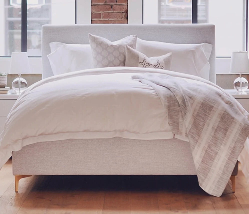
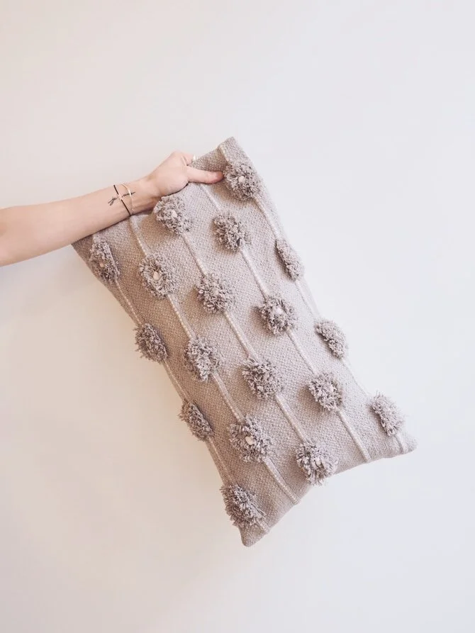
I want our master bedroom to be a cozy haven. Somewher the bed looks inviting and you just can’t wait to hop in at the end of the day. We went with a fabric headboard in a creamy white colour and paired it with linen sheets, I always think linen sheets add such nice texture and they look so fluffy. We will be adding texture and colour through our throw blanket and cushions. As for all other details like nightstands and headboards, we are up in the air right now. We’ve found some pieces we love but they’re really expensive so we are holding off for now until we find the perfect match. It will also help seeing the bed in the space first so we can get a feel for what the room needs.
The Cross — Forza Lantern (Kelly Wearstler)
not shown online.
The Cross — Kotinos Wreath
On backorder pretty much everywhere right now.
THE DINING ROOM
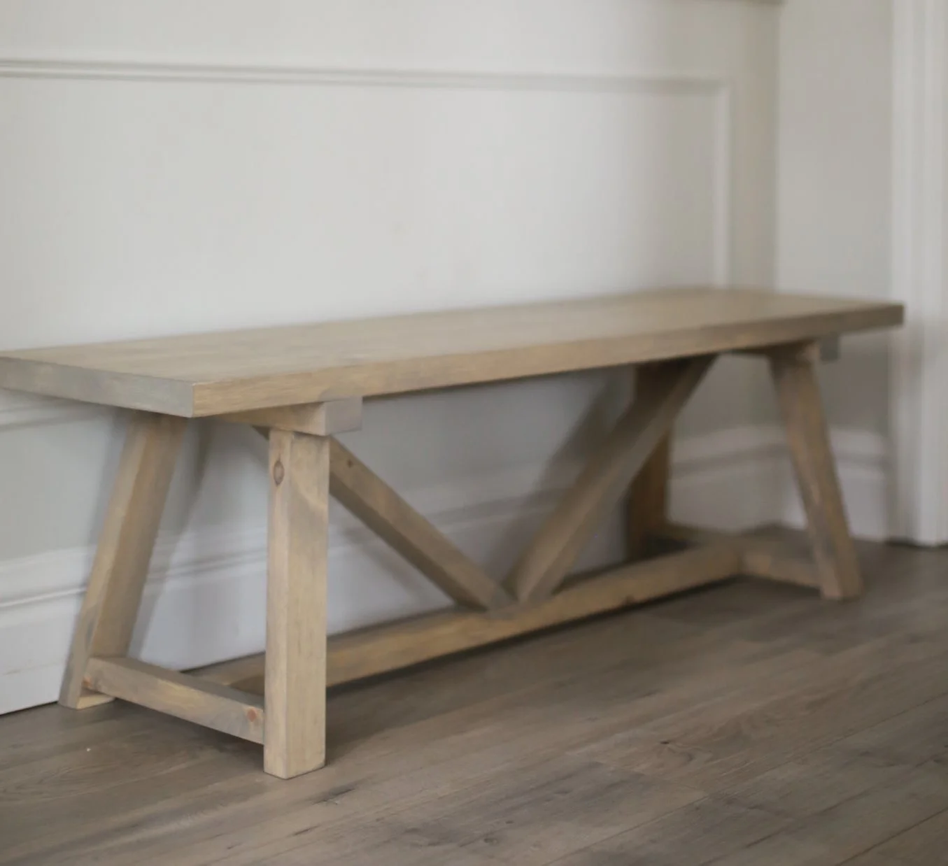
Sadly nothing in our dining room is available. Our Dining table, bench, chairs and light were all either discontinued floor models or antique. I have seen similar dome lights at Crate and Barrel in black and brass and found what I think is our exact light on an online site (Linked below). Our table, bench and light are all from the cross and our white chairs are from the little White House in fort Langley. You can find similar cross back chairs online too. As for our antique chairs, they’re farmer style dining chairs that have been painted with chalk paint, a very easy DIY.
THE LAUNDRY ROOM
ENTRANCE
Porch
We have a really small outdoor space so I really wanted to optimize it. I played around with a few different options for layout but eventually landed on a sectional with a coffee table. It felt like it used the space the most effectively.
Then the fun part, deciding on furniture. I wanted something that looked like it was from restoration hardware, without the price tag. I came across this gorgeous set from Ratana and fell in love with it. It’s an aluminum frame so it will last and the white cushions are made of a umbrella fabric which is what you want when shopping for outdoor furniture.
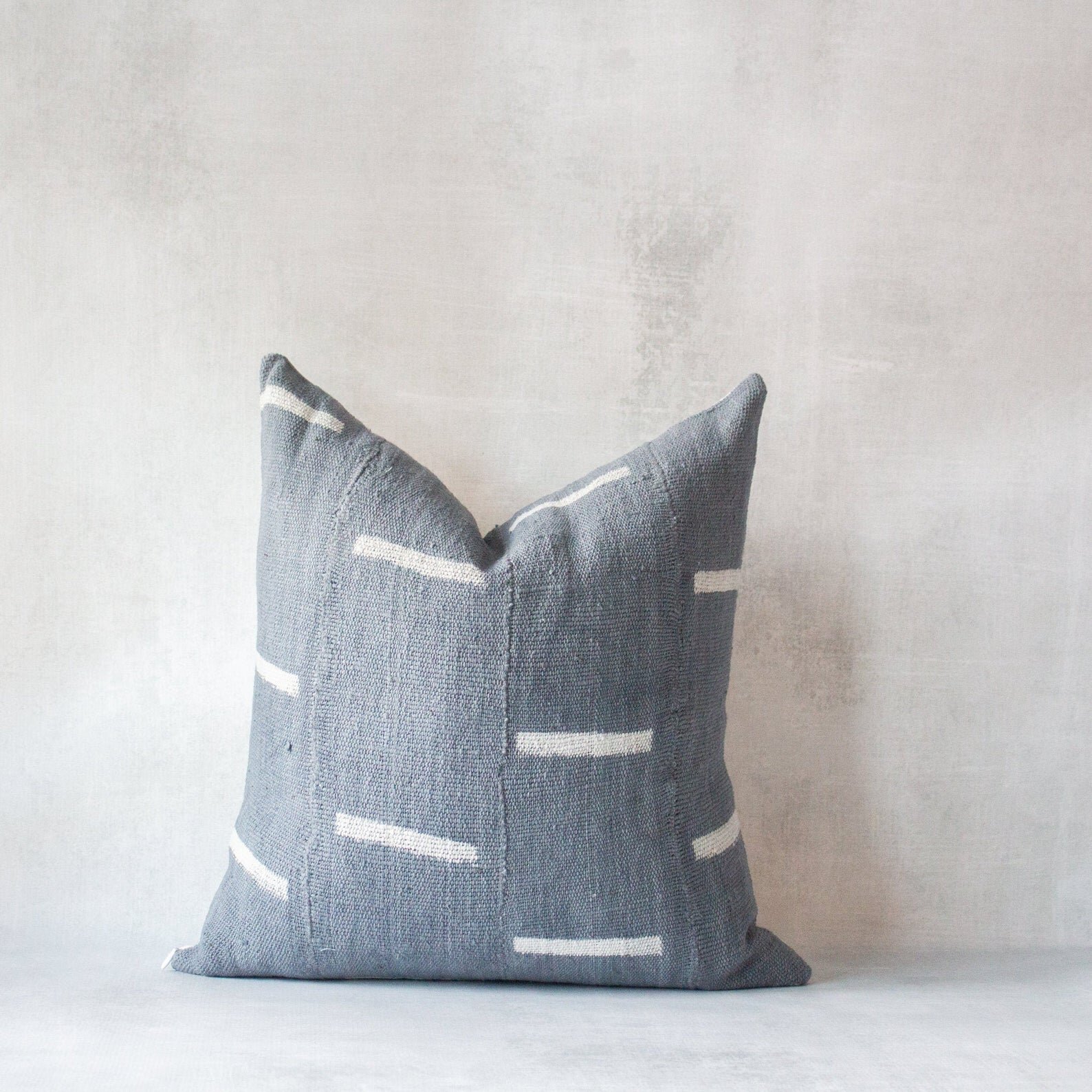
When it came to colour palette I needed to introduce a neutral blue that tied in the colour of our exterior while still working with our interior palette. We stuck to neutral tones when picking our furniture and are introducing the blueish/grey colour through accessories that can easily be switched out.
Also, check out this video for how to style a sectional from my fav Studio Mcgee.
THE OFFICE
Ikea — 115cm Mosslanda Shelf
White
